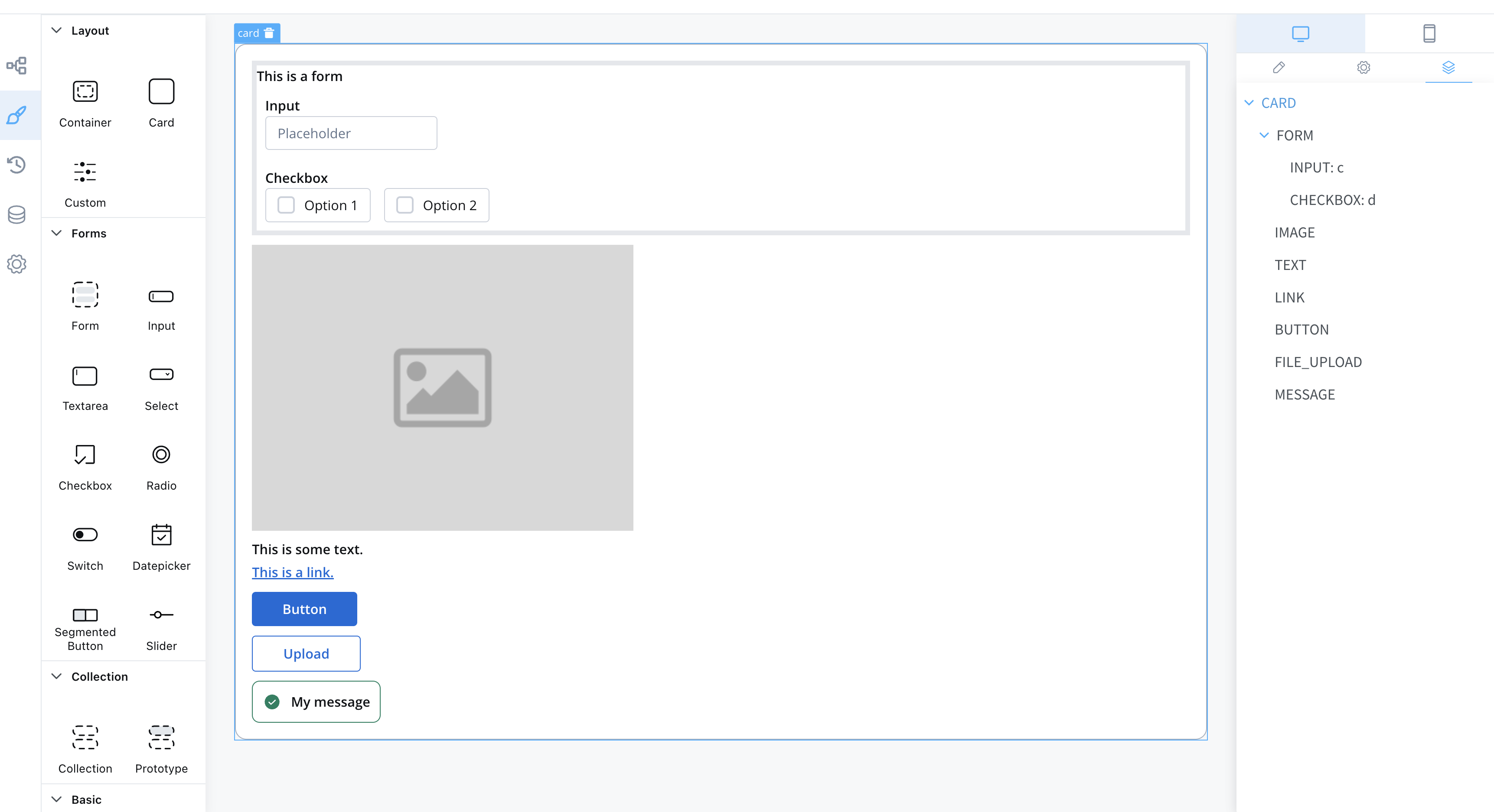
Root components
Root components, also known as layout elements, are used to group different types of components, each serving a specific purpose:
- Container - Used to group and configure the layout for multiple components of any type.
- Custom - Angular components developed in the container application and passed to the SDK at runtime, identified here by the component name.
- Card - Acts like a Container component; it also has the option to become an accordion.
The root component can hold a hierarchical component structure as follows:

Available children for Card and Container are:
- Form - Used to group and align form field elements (inputs, radios, checkboxes, etc.).
info
For more information about the form elements, please refer to theForm elements section.
- Image - Allows you to configure an image in the document.
- Text - A simple text can be configured via this component; basic configuration is available.
- Link - Used to configure a hyperlink that opens in a new tab.
- Button - Multiple options are available for configuration, with the most important part being the possibility to add actions.
- File Upload - A specific type of button that allows you to select a file.
- Custom - Custom components.
- Indicators - Message UI elements to display different types of messages.