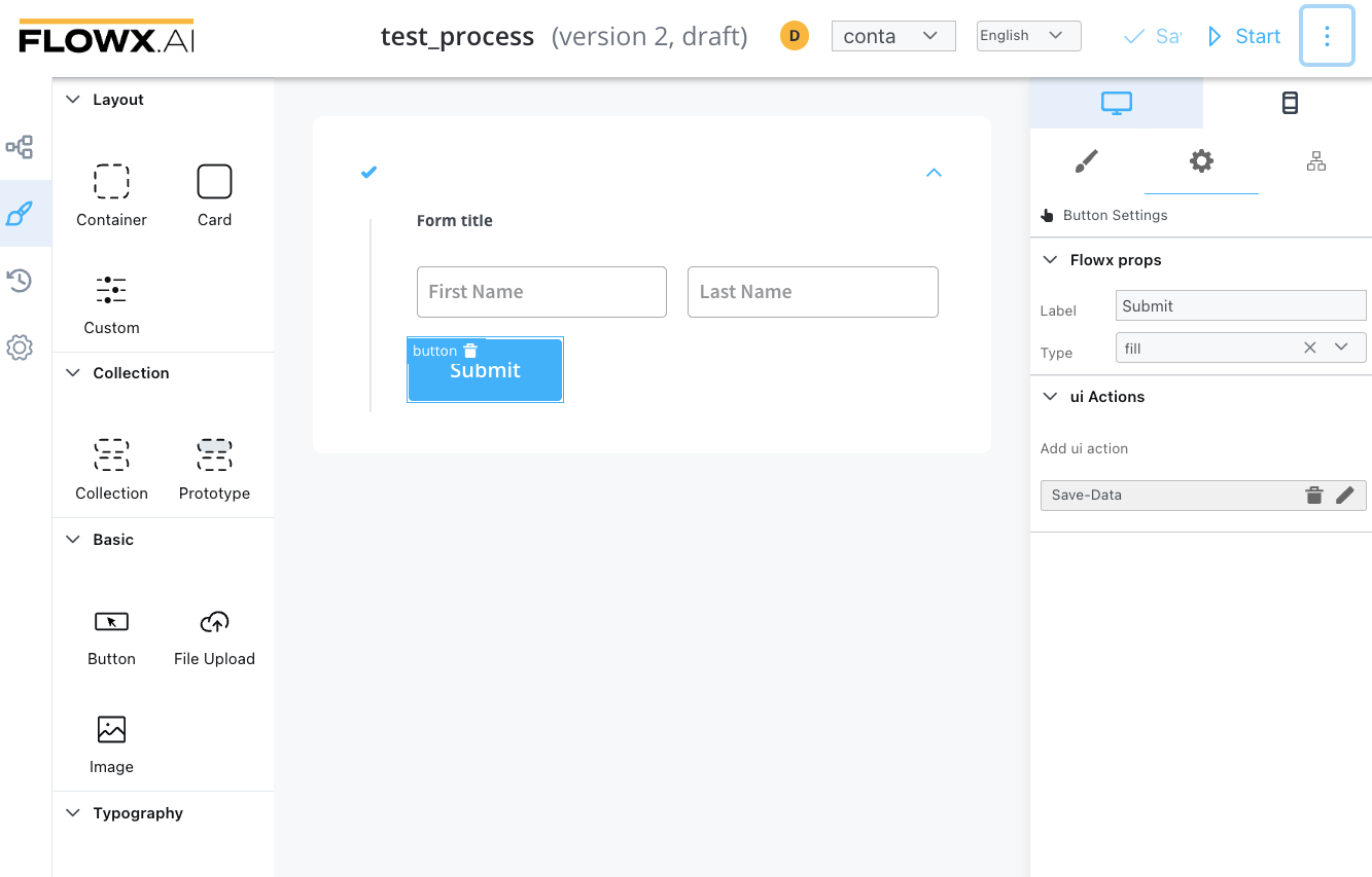
Buttons
There are two types of buttons, similar to each other but with different purposes:
Button
There are used to do an action, unblock the token to move forward in the process, send an OTP, and open a new tab.
Sections that can be configured regarding general settings:
- Flowx props
- Label
- Type - button type: fill/flat
- Add UI Action - defines what action the button will trigger (more details on how to configure UI actions)
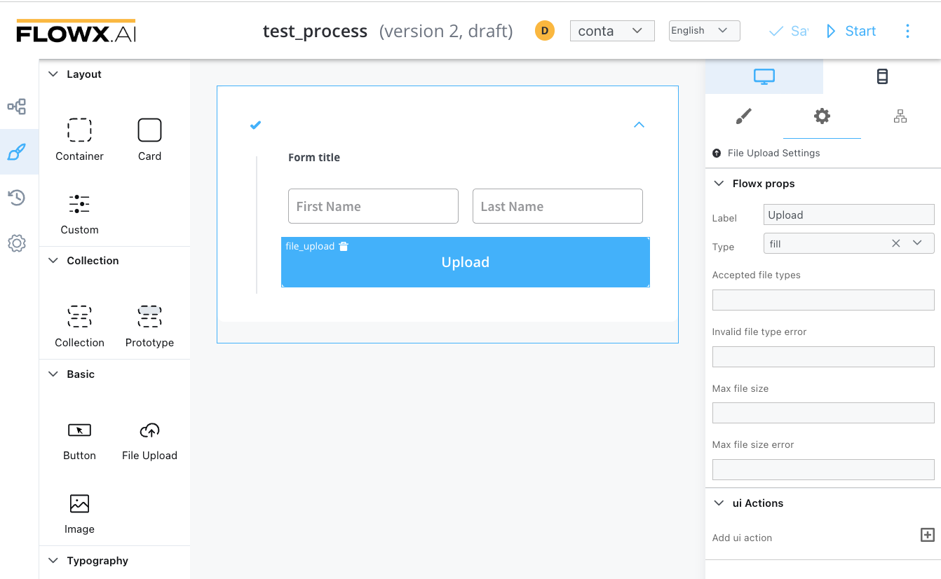
File Upload Button
This button will be used to select a file and do custom validation on it. Only the Flowx props will be different.
Additional properties:
- Accepted file types
- Invalid file type error
- Max file size
- Max file size error
- Add UI Action