Card
A card is a graphical component that allows grouping and alignment of other components. It can also include an accordion element for expanding and collapsing content.
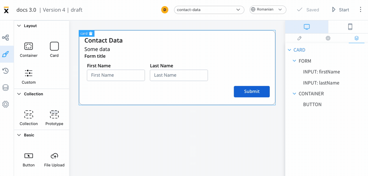
The following properties that can be configured:
Settings
- Message - a valid JSON that describes the data pushed to the frontend application when the process reaches a specific user task
- Title - the title of the card
- Subtitle - the subtitle of the card
- Card style - you can choose between a border or raised style
- Has accordion? - this feature allows you to add a Bootstrap accordion, which organizes content within collapsible items and displays only one collapsed item at a time
caution
Accordion element is not available for mobile.

Styling
Layout - This property is available for components that group children and includes the following options:
- Direction - Horizontal / Vertical (for example, select Vertical)
- Justify (H) - (for example, select center)
- Align (V) - this option allows you to align components vertically
- Gap - you can set the gap between components
More layout demos available below:
»Layout DemosThis example will generate a card with the following layout configuration:

For more information about styling and layout configuration, check the following section:
»UI DesignerValidating elements
To validate all form elements under a card, you need to set the key of the form/element on the property of the button: Forms To Validate.
