Checkbox
A checkbox form field is an interactive element in a web form that provides users with multiple selectable options. It allows users to choose one or more options from a pre-determined set by simply checking the corresponding checkboxes.
This type of form field can be used to gather information such as interests, preferences, or approvals, and it provides a simple and intuitive way for users to interact with a form.
Configuring the checkbox element
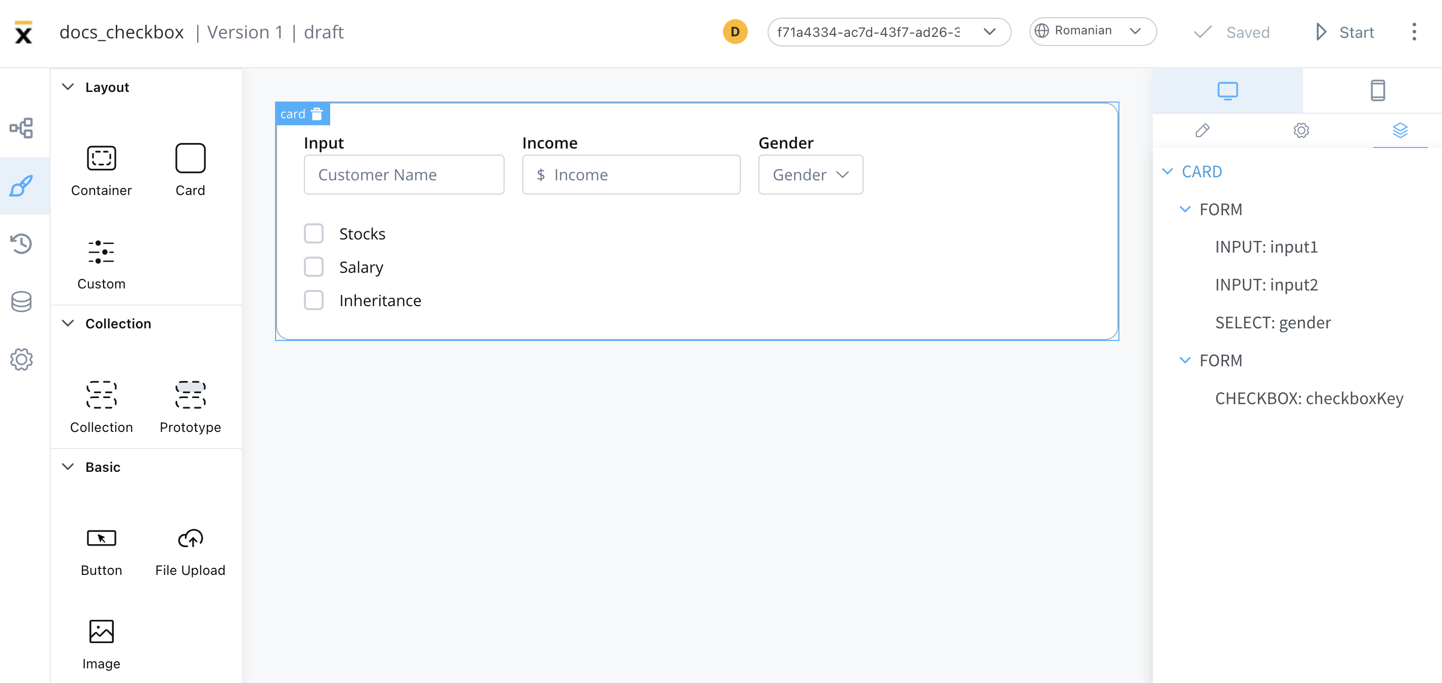
Checkbox settings
The available configuration options for this form element are:
General
- Process data key - creates the binding between form element and process data, so it can be later used in decisions, business rules or integrations
Properties
- Label - the label that appears on the checkbox
- Helpertext - additional information about the checkbox (can be hidden inside an infopoint)

Datasource
- Default Value - the default value of the checkbox
- Source Type - it can be Static, Enumeration, or Process Data
- Add option - label - value pairs can be defined here

Validators
The following validators can be added to a checkbox: required and custom (more details here).

Expressions
The checkbox behavior can be defined using JavaScript expressions for hiding or disabling the element. The following properties can be configured for expressions:
- Hide - JavaScript expression used to hide the checkbox when it returns a truthy value
- Disabled - JavaScript expression used to disable the checkbox when it returns a truthy value
It's important to make sure that disabled fields have the same expression configured under the path expressions → hide.
UI actions
UI actions can be added to the checkbox element to define its behavior and interactions.
- Event - possible value:
CHANGE - Action Type - select the action type
For more details on how to configure a UI action, click here.
Checkbox styling
Properties
The type of the checkbox can be selected by using the styling tab in UI Designer, possible values:
- clear
- bordered
Typography
You can customize the typography for the following properties:
- Label
- Options
- Helper & errors

For more details on how to upload and manage fonts, check the following section:
»Font managementFor more valid CSS properties, click here.
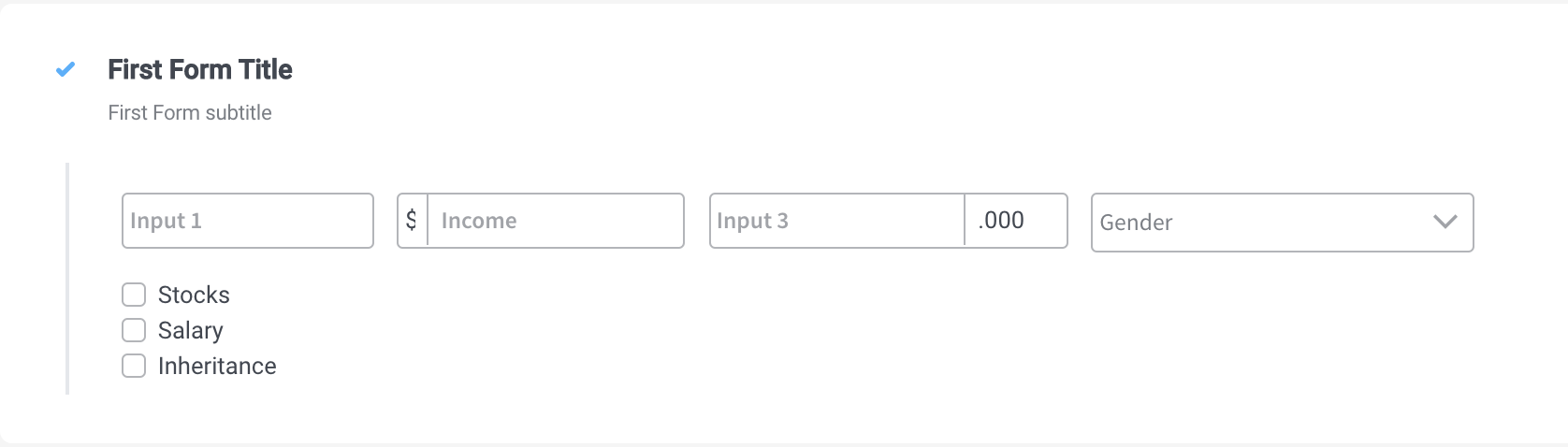
A clear checkbox element with three options added, and a column layout will look like as it follows: